

What happened in the last two months?
What happened in the last two months?
Next — Today I Learnt About Data Science | Issue #74

Hi there!
Recently, I did a road trip through Utah and Colorado, camping, biking and rafting along the way. Then, I wrote a blog on it. I’ve heard its a nice read!
Anyway, here is a bimonthly recap of interesting stories. Read on.
Five Stories
National Geographic Society World Water Map
National Geographic
This story is about the global water crisis and how humans are using more water than the water cycle can provide. It is based on a model developed by Utrecht University that shows where and why water gaps arise, how climate change might worsen them, and how they might be managed.
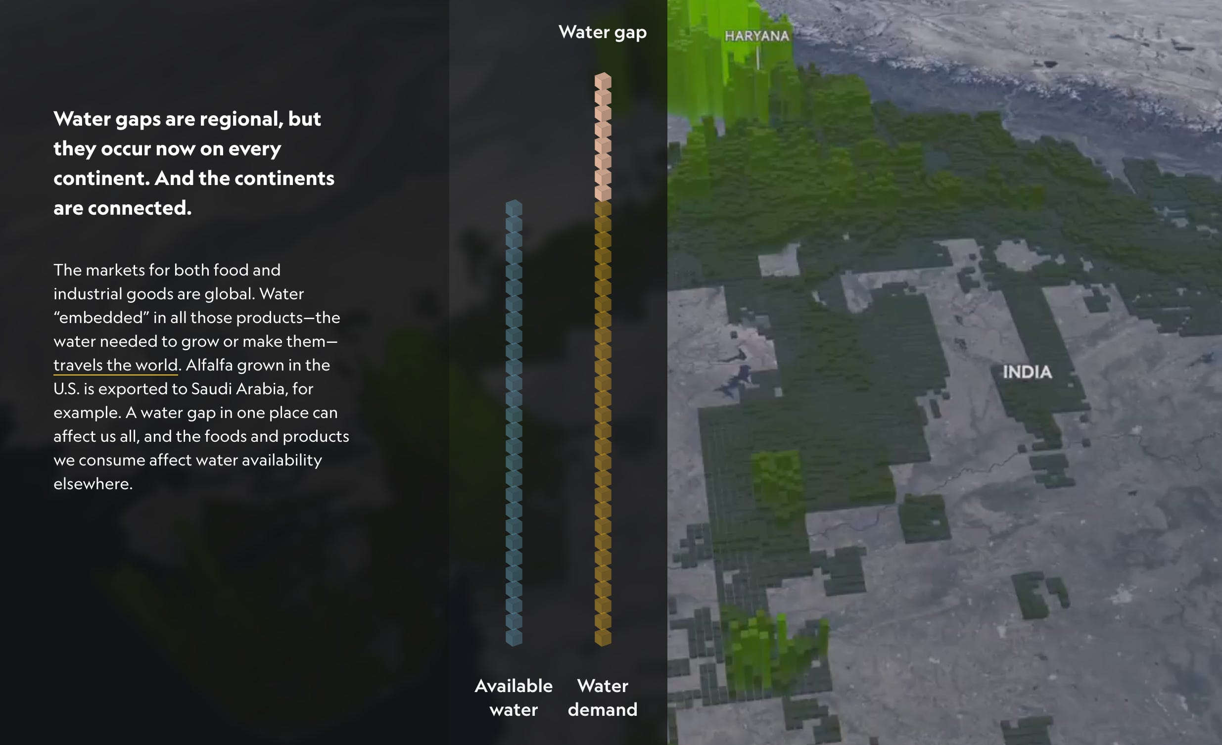
India has had to pump more groundwater than any other country. The bulk of it is for irrigation. In the arid northwestern states of Punjab and Haryana, thirsty rice and wheat are now the dominant crops, and wells the main source of irrigation water. The water table is sinking up to three meters a year.
Choosing between mass famine and groundwater depletion, the Indian government chose the latter.
Type in your job to see how much AI will affect it
Washington Post and UPenn researchers considered two AI use cases: image generators and large language models. Then, they calculated how much would the job be affected by AI. This doesn’t necessarily mean they would be replaced by AI, but could simply mean the productivity boost.
Management, business and finance, and Sciences and computer science are the two largest categories getting affected by the advent of AI.
Junk Charts
This blog is about data visualization and data analysis. The author reviews and critiques various charts and graphs from different sources, and offers suggestions for improvement.
Some cool ones:
Lay off bubbles (How bubble charts scale)
Some chart designs bring out more information than others (Why bump charts are better than two-column bar plot to show differences)
An interactive map that mostly works, except for the color scale (How not to use colours)
See your identity pieced together from stolen data
You may be familiar with "Have I Been Pwned," a website designed to track where your personal information appears in various data leaks. This service was illuminating in its own right, but ABC introduces a more sophisticated visualization.
Enter your email address (rest assured, ABC News does not retain it) to embark on a captivating journey through past data breaches. Discover which application or website released specific pieces of your information and observe how these fragments can be assembled to create your comprehensive digital identity. It is scary.
Urban Resilience: Tirana, a Case Study [Part 1]
In this intriguing exposition, Dea explores resilience of Albania's bustling capital, Tirana. She uses population count data and spatial analysis tools like PySAL to understand the city's rapid urbanization and shifting demographics over three transformative decades.
To analyze population dynamics and spatial dependence, she employs spatial Markov models. Spatial autocorrelation is used to measure spatial dependence between similar and different valued areas, with Queen Contiguity computing the spatial weight matrix for this dependence.
The results reveal that areas are more likely to remain in their current state, suggesting that places tend to retain their character in the short term. Pretty cool! Part 2 is here, which I will cover next week.
Four Packages
retrying is a Python package for situations when working with a flaky function, something that’s error prone. Github. Blog.
charlatan is an R package to generate fake data in R. Vignette. Github.
faker is a Python package that generates fake data for you. Vignette.
clue is an R package that provides an extensible computational environment for creating and analyzing cluster ensembles, which are collections of clusterings of the same objects. Vignette.
Three Jargons
In Issue #72, I asked ChatGPT to write the definitions in “humorous but intelligent manner”. It slaps!
Hash: Ah, hash! No, we're not talking about the delicious dish of diced meat, potatoes, and onions. In the computer realm, a hash is like a magical cooking pot where you throw in any quantity of data, no matter how large, stir it a little (or a lot), and it spits out a fixed-size garble of characters that looks like your cat danced on the keyboard. You can use this to uniquely identify your data, just like you uniquely identify that oddball uncle in every family reunion photo.
Hash Collision: This is the unfortunate event that occurs when two distinct pieces of data go through the magic cooking pot (i.e., hashing) and end up with the same cat-dancing-on-the-keyboard outcome. This is akin to two totally different people ending up with the same fingerprints. In the world of hashing, this is like the universe saying, "Oops! My bad." Remember, this is extremely rare, like finding someone who enjoys fruitcake.
Salting the Hash: Now, just when you thought hashing couldn't get more culinary, here comes a pinch of salt. Salting the hash is the act of adding a little secret spice (i.e., a random string) to your data before you hash it. This is the digital equivalent of adding a mustache and glasses to your fingerprints to avoid hash collisions. Basically, it's like your data goes undercover to avoid being mistaken for someone else, ensuring that the outcome is as unique as a snowflake in the Sahara.
Two Tweets

https://twitter.com/sterlingcrispin/status/1665792422914453506
https://twitter.com/rappa753/status/1663908243666530304
One Meme

Bonus
Recently, Dea shared a poem that hit home: Househunting On Behalf Of My Cat by
. Leading lines:I am househunting on behalf of my cat
But there doesn’t seem to be much on the market right now
It is not as if she is asking for the moon on a stick
Just a quiet place, away from main roads
With no moronic asshole dogs next-door
…